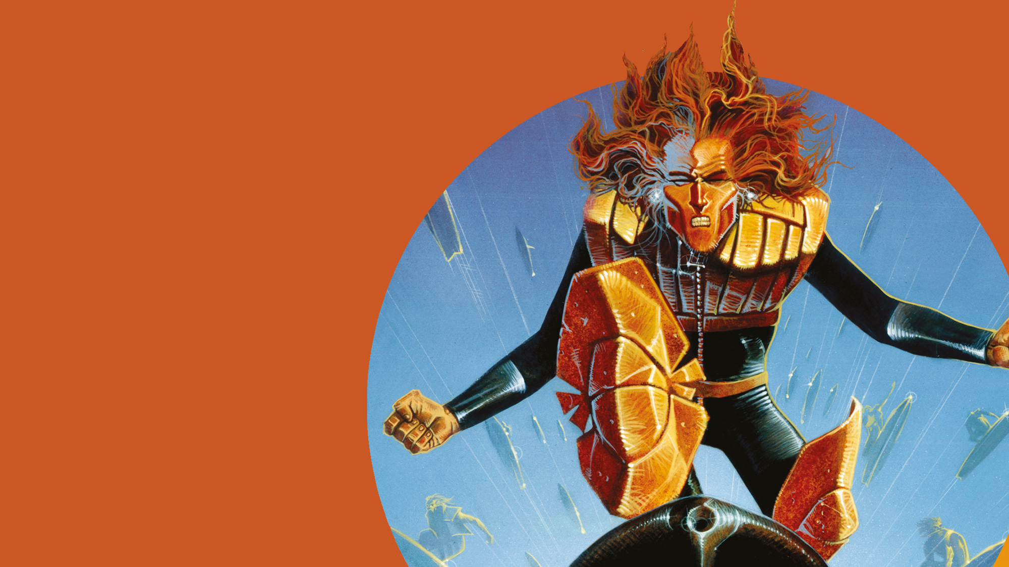
CHOPPER!
Get the brand new T-shirts, glasses and mugs featuring the legendary skysurfing rebel!

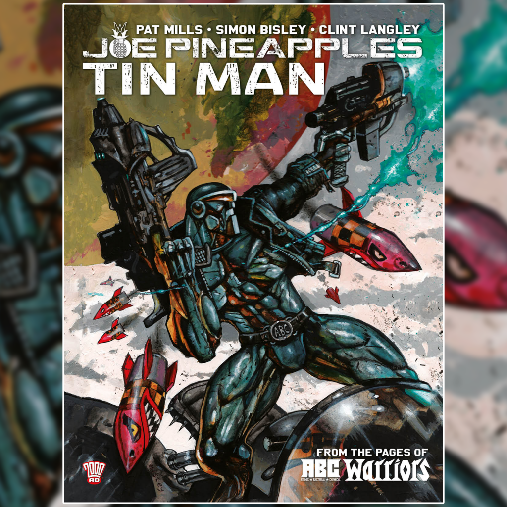
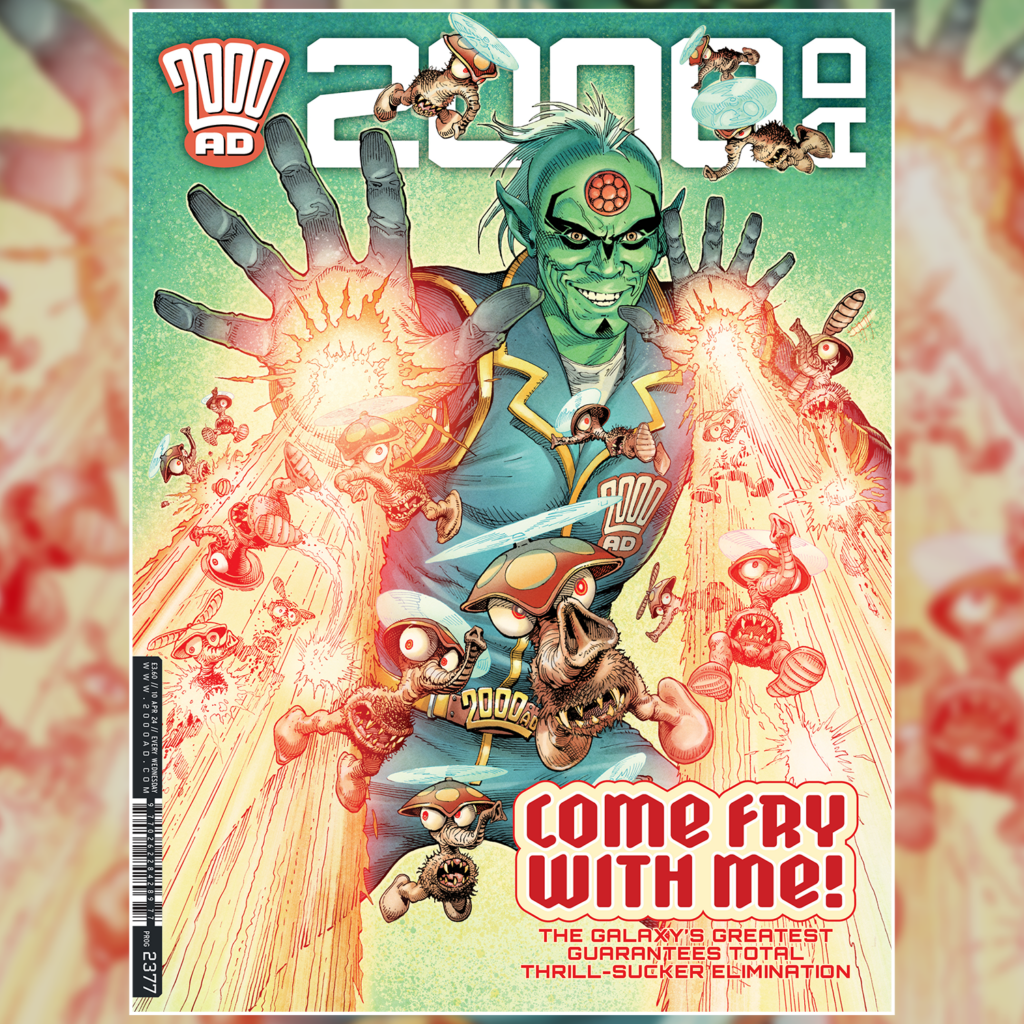
LATEST RELEASES


LATEST GRAPHIC NOVELS


2000 AD THRILL-CAST
PODCAST
Listen now to 2000 AD’s award-winning official podcast – the 2000 AD Thrill-Cast! Beamed direct from the Nerve Centre of the Galaxy’s Greatest Comic, every fortnight publicity droid Molch-R brings you the lowdown on the Galaxy’s Greatest Comic, interviewing some of the world’s greatest comics creators, welcoming special guests, giving you exclusive announcements and the chance to win zarjaz prizes – plus so much more! You can subscribe to the Thrill-Cast on iTunes or download on Soundcloud and Podomatic.
LISTEN NOW ON
-

15th April 2024
Was this the CREEPIEST comic ever? – The 2000 AD Thrill-Cast
This episode is not for the nervous! At least that’s what Ghastly McNasty, the editor of Scream! might claim! With a brand new hardcover collection publishing all the stories from the 1980s horror comic in order out in May, the Thrill-Cast talkes to its editor Ian Rimmer, sub-editor and writer Simon Furman, and SFX editor […] More…
-
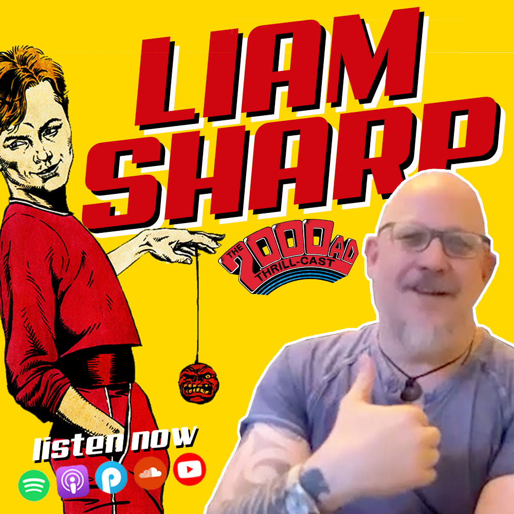
1st April 2024
“I feel like a son of 2000 AD” – Liam Sharp on the 2000 AD Thrill-Cast
From “gifted child” to million-selling comic artist, Liam Sharp’s artistic journey has been one of high hopes and hard work. Beginning his career as an apprentice of legendary The Rise & Fall of The Trigan Empire artist Don Lawrence, Sharp went on to debut at 2000 AD while still in his teens and co-create the precocious homocidal teenager PJ […] More…
-
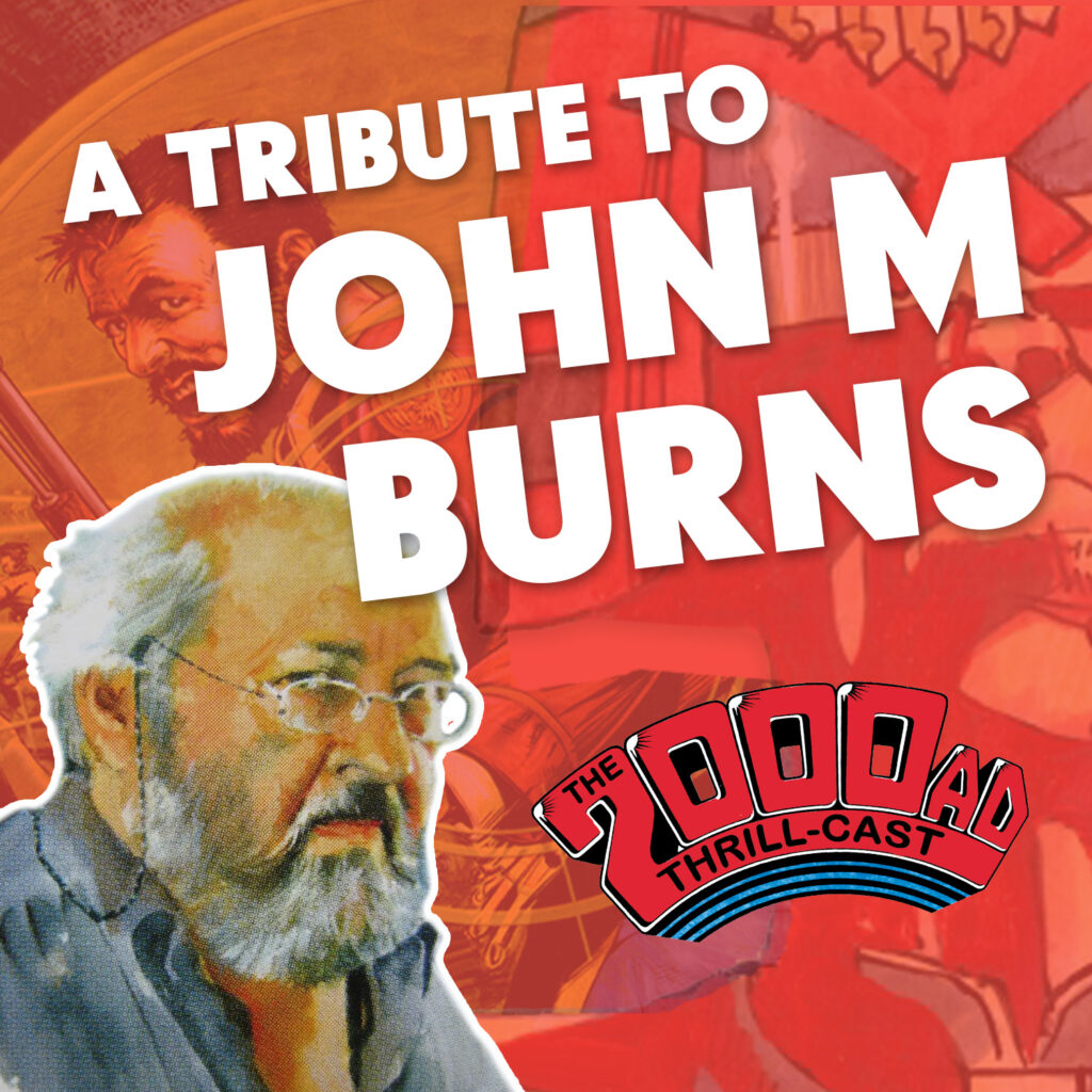
18th March 2024
A Tribute to John M Burns – The 2000 AD Thrill-Cast
At the very end of 2023, the legendary artist John M Burns sadly passed away. While well known amongst 2000 AD fans for his extensive work on stories including Judge Dredd, The Order, and Nikolai Dante, Burns’ career spanned six decades and endeared him to generations of readers thanks to enthralling and enchanting work on TV tie-ins such as Champion […] More…
-
4th March 2024
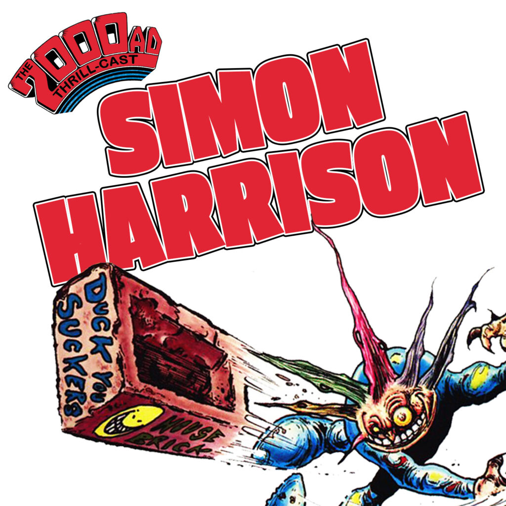
Simon Harrison on Bradley, Revere & beyond – The 2000 AD Thrill-Cast
2000 AD has had more than its fair share of artists whose work can be described as “unique” – but few match the distinctive individuality of Simon Harrison. From his first work on the demonicly badly-behaved alien infant Bradley to the lead up to the most iconic moment in Strontium Dog and the fever dream […] More…
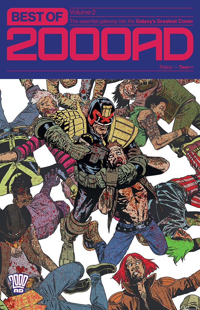
Best of 2000 AD
The Ultimate 2000 AD Mix-Tape Has Arrived!
Ever wanted to get into reading the legendary 2000 AD? This is the book for you – no continuity, no serialisation, just tailor-made comics for new readers.
A celebration of 45 years of 2000 AD
Featuring celebrity fans and legendary creators, The Galaxy’s Greatest will stream online and for free on 26 and 27 March on 2000 AD’s social media channels and YouTube, and Rebellion’s dedicated Twitch stream.